
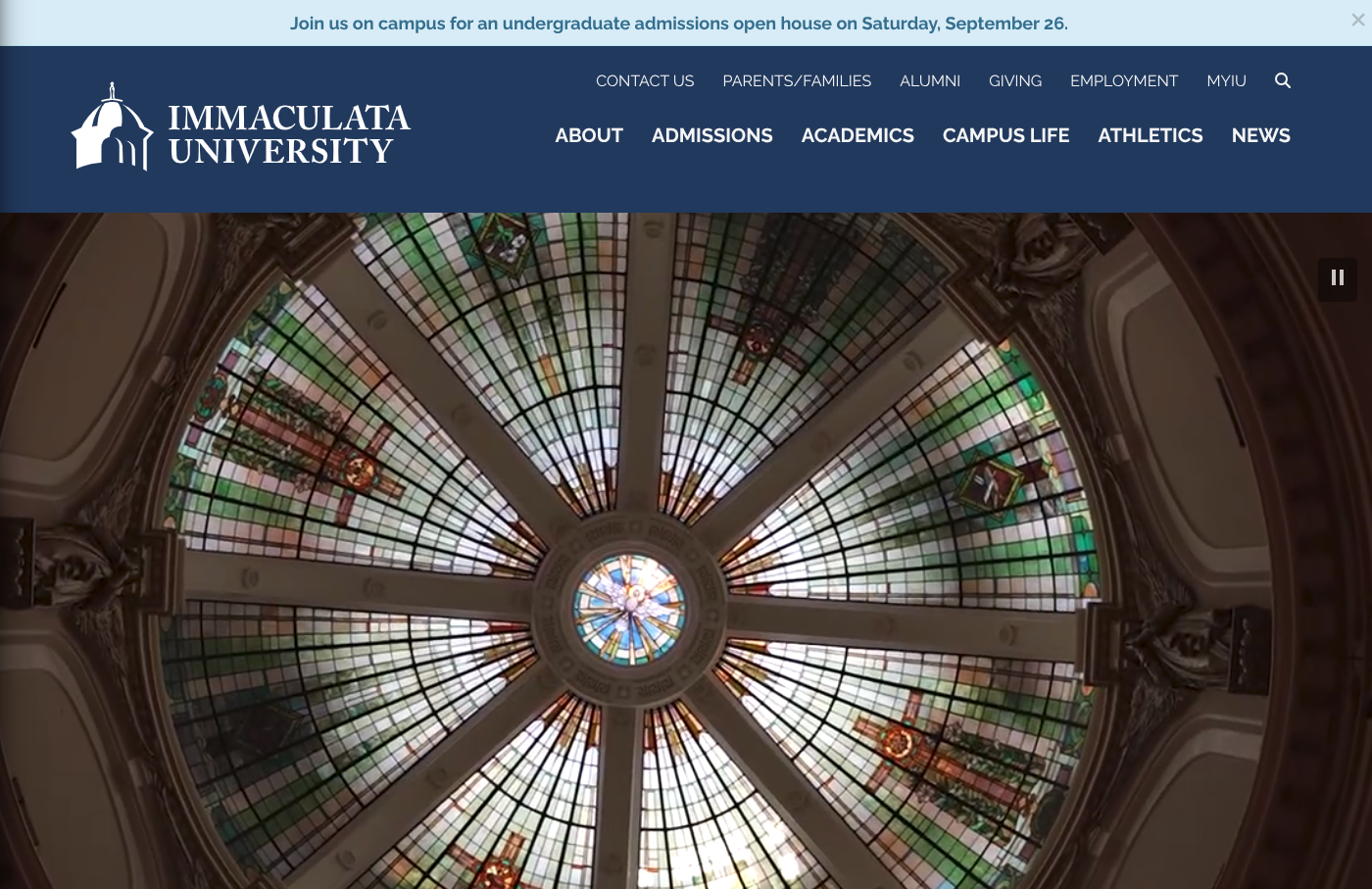
This post is part of a weekly series reviewing higher-education websites through the lens of prospective students and families, focusing on the information they need from a website and how well institutional sites help them find it. Reviews are published in a spirit of collegiality and support. If you notice an inaccuracy or have an issue with a website review, please get in touch.
See more college and university website reviews.
In this Immaculata University website review I look at immaculata.edu the way a prospective undergraduate and a parent would, with attention to the tasks that matter most: exploring programs, understanding cost, applying, and planning a visit. Immaculata has built a calm, well-organized admissions experience that puts the right handful of decisions where families expect to find them, and it backs that up with unusually plain talk about price. A few findability details, mostly around consistent user flows and program discovery, are the main places where the experience could go from good to reassuring for the prospective student audience.
Immaculata University at a glance
- Location: Immaculata, Pennsylvania, in suburban Chester County west of Philadelphia
- Type: Private, Roman Catholic university
- Founded: 1920
- Total enrollment: About 2,300 students with roughly 1,650 undergraduates and a sizable graduate and adult population
- Athletics: NCAA Division III, Atlantic East Conference, competing as the Mighty Macs
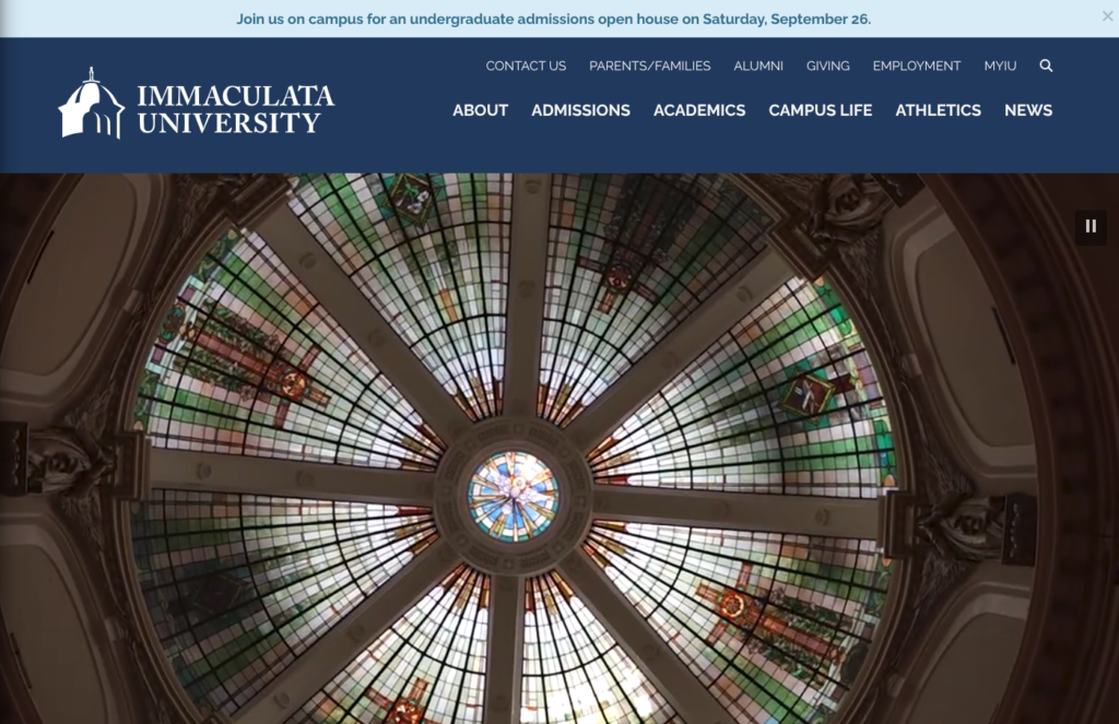
Summary of Immaculata University Website Review
Clear strengths
- A genuine task hub. The undergraduate admissions page distills the visit into six choices for a family: explore programs, tuition and fees, financial aid, apply, request information, and visit. That restraint is harder to pull off than it looks, and it serves the priority experiences well.
- Cost transparency that respects the reader. The tuition page states the full-time figure plainly, itemizes fees down to lab and course charges, and pairs the sticker number with the reassurance that every accepted full-time student receives a scholarship ranging from $6,500 to full tuition. Families rarely get this much candor this early.
- A visible, well-placed net price calculator. The estimator lives right in the undergraduate tuition section rather than buried a few levels down, which is exactly where a cost-focused parent expects to find it.
- Explore programs auto-filtering search is effective for exploring programs, even if the keyword doesn’t appear in the title of the program.
- Warm, mission-grounded identity. The blue-and-white brand and the recurring “grounded in IHM tradition and charism since 1920” line give the site a consistent, welcoming voice, and the color palette holds up well against text without contrast concerns.
- Low-friction applying. Rolling admissions, a free online application, the Common Application as an option, and a test-optional posture are all stated clearly, with a realistic three-to-four-week decision window that sets honest expectations.

Strategic opportunities
- Update DNS to provide a path from “immaculata.edu” to “www.immaculata.edu” and avoid the SSL certificate / security error. This was a tested and confirmed issue on two different browsers, and should be an easy fix in DNS to avoid a disruptive error.
- Keep consistent paths for each audience. Following the tuition path from the undergraduate admissions page landed me back at general tuition information and required an additional click to get to undergraduate-specific tuition information. Streamlining this flow will help users find what they need with less effort.
- Clarify the many front doors for different learners. Traditional undergraduate, adult professional, and graduate paths all share space in the admissions navigation. The labels are clear, but a first-time visitor has to self-sort quickly, and a moment’s ambiguity can cost momentum.
- Bridge the program exploration and admissions pathways with stronger navigation across the two. A prospective student exploring programs has to find their own way back to Admissions after looking at available programs.
Technical foundations
The public site runs on WordPress with a page-builder layout using a Beaver Builder theme, and the SEO groundwork is handled through All in One SEO Pro. Analytics and tag delivery flow through Google Tag Manager. The application and inquiry experience is powered by a Slate customer relationship management platform on an admissions subdomain, which is a common and capable choice for an institution of this size. A YouVisit-powered virtual tour rounds out the discovery experience for families who cannot travel. The footer carries the governance signals a careful reader looks for: consumer information, a privacy policy, an accessibility statement, and the annual security and fire safety report.
Performance and quality scores below are drawn from Lighthouse via PageSpeed Insights. When a home page scores lower than an interior admissions page despite carrying lighter content, it usually points to homepage media weight rather than a site-wide issue, and it is worth watching because the home page is where many families arrive first.


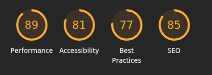
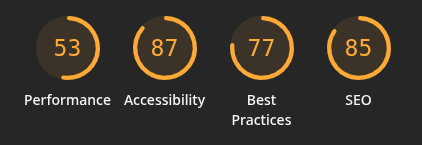
The scores tell an encouraging story with one clear place to focus. Accessibility lands in a solid range across the board, from 81 to 93, and SEO holds steady between 85 and 92, both signs of careful groundwork. Best Practices sits at 77 everywhere, which points to a single site-wide item worth a look rather than a page-specific problem. Performance is where the pages diverge: the admissions page scores a healthy 89 on desktop and 53 on mobile, while the home page comes in at 63 on desktop and 44 on mobile. It is worth noting that the home page scores lower than the interior admissions page even though it is the first stop for many families, which usually points to homepage media weight or third-party scripts rather than anything structural. Since the home page is where most visitors arrive and mobile is how many of them browse, tuning that page’s load would pay off directly in the priority experiences.
Information architecture and findability
The top navigation follows the pattern families have learned to expect: About, Admissions, Academics, Campus Life, Athletics, and News. Within Admissions, the sub-menu is thorough, naming the visit, transfer, undergraduate, adult, graduate, international, and veteran paths directly. For a prospective student who already knows which door is theirs, this works well, and the persistent Apply and Visit links in the utility area keep the two most important actions within reach on every page.
The place to keep an eye on is discovery for the undecided. A family still weighing whether Immaculata is the right fit lands on a rich set of choices, but the program experience asks them to know what they are looking for before the site helps them find it. Adding a little more guidance, grouping by broad interest or surfacing signature programs like nursing and education where the exploring happens, would meet those visitors closer to where they actually are in the decision.
Cost, financial aid, and transparency
Cost is often the center of the decision for the families this site serves, and this is where Immaculata is at its best. The undergraduate tuition page leads with the full-time figure and lays out the fees in detail, from the student services fee to specific course and lab charges, so there are few surprises later. Just as importantly, it frames that number honestly, noting that every accepted full-time undergraduate qualifies for a scholarship between $6,500 and full tuition, and that the online application carries no fee. The net price calculator sits right where a parent would look for it, and the deposit amounts and enrollment steps are stated plainly.
The one thing that would help a family the most is a single, consolidated view of the full cost of attendance, tuition, fees, housing, and dining together in one place, so the question “what will a year actually cost” can be answered without assembling pieces from separate pages. The information is present and honest. Pulling it into one estimate-friendly view would let a family finish that task in one sitting.
Accessibility, usability, and inclusivity
Immaculata includes an accessibility statement in the footer, includes a skip-to-content link, and uses a color palette that reads clearly against its backgrounds. The admissions copy is written in plain, welcoming language, and student profiles put real faces to the programs in a way that helps prospective students picture themselves on campus. The virtual tour extends that welcome to families who cannot visit in person, which matters for a regional university drawing from a wide area.
As with most page-builder sites, the details worth periodic attention are image alternative text, heading order on longer pages, and the consistency of link labeling. None of these rose to the level of a barrier during this review, and the overall posture is careful and considerate.
Executive lens: enrollment, risk, and governance
Enrollment and funnel
The site supports the awareness-to-application path capably. Request-for-information and apply actions are visible throughout, admissions events are surfaced on the undergraduate page, and the rolling, test-optional, no-fee application removes friction at the moment of commitment. The clearest funnel gain available is in the middle of the journey, helping undecided prospects narrow toward a program, since that is where interest either firms up into an application or quietly drifts.
Risk and compliance
The governance basics are in place and easy to find: privacy policy, accessibility statement, consumer information, and the annual security report. Maintaining consistent alternative text and heading structure across page-builder templates is the ordinary, ongoing way a site like this keeps its accessibility posture strong over time.
Governance and maturity
The main site and the Slate application portal are clearly managed with care, and the WordPress plus Slate combination is a sound, sustainable foundation. The visible maturity opportunity is consistency at the seams: aligning duplicate links to a single canonical destination and carrying the brand across the handoff into the application portal, so the whole experience reads as one institution speaking with one voice.
Recommendations
- Consolidate the tuition, fees, housing, and dining figures into a single full-cost-of-attendance view so a family can answer the cost question in one place.
- Add guidance to program discovery, grouping by interest area and surfacing signature programs, to help undecided visitors move forward.
- Keep alternative text and heading order consistent across page-builder templates as pages are added and updated.
- Improve page and server performance on the pages where it matters most. The fixes will likely carry over to improve other parts of the site.
An invitation to collaborate
This series exists to support the people doing hard, careful work on higher-education websites, and to share what we notice from the outside looking in as a student or parent would. The observations here are offered in that spirit: as a colleague’s read, not a verdict. If a deeper, institution-specific look at the digital experience would be useful, whether on findability, cost transparency, or the application journey, we would welcome the conversation.
Want to work together? Get in touch.
Disclaimer: This review is based on publicly available information at a specific point in time and reflects professional opinion offered constructively. Websites change frequently, and details may have shifted since publication. Institutions are welcome to submit corrections or updates, which will be incorporated promptly.